After speaking with her though, I decided to actually compare/contrast the two. And, I'm ashamed to admit that I had not realized the new Forms has caught up with the old Forms. Though I use it several times a week, I had decided to stay in the old Forms (in my school account) and in the new Forms (in my personal). But, after reviewing the two, the only substantial difference is in the view.
Here's the breakdown of the new vs. old:
The interface:
The new Google Forms certainly has a cleaner interface. It looks more friendly. However, it lacks some of the functionality of the old Forms.
 |
| Old Forms is on left; new Forms is on right |
Settings:
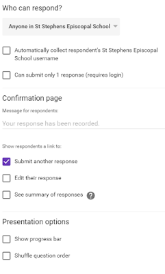
The settings are located in different locations in the versions. In the old version, the settings appear at the top and at the very bottom. In the new, you must click the gear (a consistent tool throughout Google products) to view the settings. While this helps keep the interface cleaner, it is another click for users.
In the old Forms, you have the following options.
Themes:
In the old Forms, users can change fonts, font sizes, colors and, backgrounds. In the new Forms, users can add an image of their own to the header (same as old). However, it will automatically pair a solid color with it. It also does not allow for font selection and font sizing.
Questions:
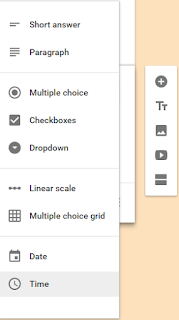
The old Forms offers the following questions types.
And, the new Forms offers the following question types.
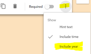
For a while, when you selected Date or Time as question types in the old Forms, you could choose to do both. For instance, if you selected Date, you could add Time to that question as well. In the new Forms, this was not an option. It is now, but it is disguised...
Otherwise, the question types are the same - only in different locations.
Responses:
This feature is definitely improved in the new Forms. Now, you can view a summary of responses (previously only accessible through the corresponding sheet) and the individual responses. Before, it only showed the responses in a spreadsheet. Now, you can see them in their Form view and print/save as PDF in that view as well. This is a huge improvement.
Individual response view:
Summary response view:
Add-ons:
This feature is the same in new and old. However, I find it a bit confusing. there is a button that says "add-ons" when you hover over it. These are the add-ons YOU have installed. To get more, you have to click on the three vertical dots in the far right and choose "Add-ons."
Sharing Form:
The sharing feature is nearly the exact same. The only difference is in the appearance and location. The only real difference is in viewing the live Form. In the old version, you could click on "View Live Form." This is now called "Preview."
I have finally moved both of my views to the new Google Forms. Though, I miss the editing features of the fonts in the old...
You can check out some of my favorite Forms features and uses in Fabulous-ize Your Forms presentation. You can also check out fennovation.org for all things Drive.
Enjoy!


No comments:
Post a Comment